All about Expression
In 2001 we wanted to to break out of the creative status quo prison we felt design, and in particular furniture design, was caged within. So we moved to another lane.
One of the earliest bodies of Fredrikson Stallard work “The Units” are a literal encompassing of this struggle against the tide. They were essentially thinking outside the box, within a box.
The volume had to be static, in perfect proportions and in harmony. We started to create volumes based on the golden cut but non of these felt correct in proportions. After many experiments we developed our format of 130 x 100 x 25 cm as our canvas which we use to this day.
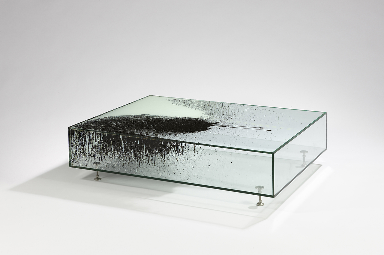
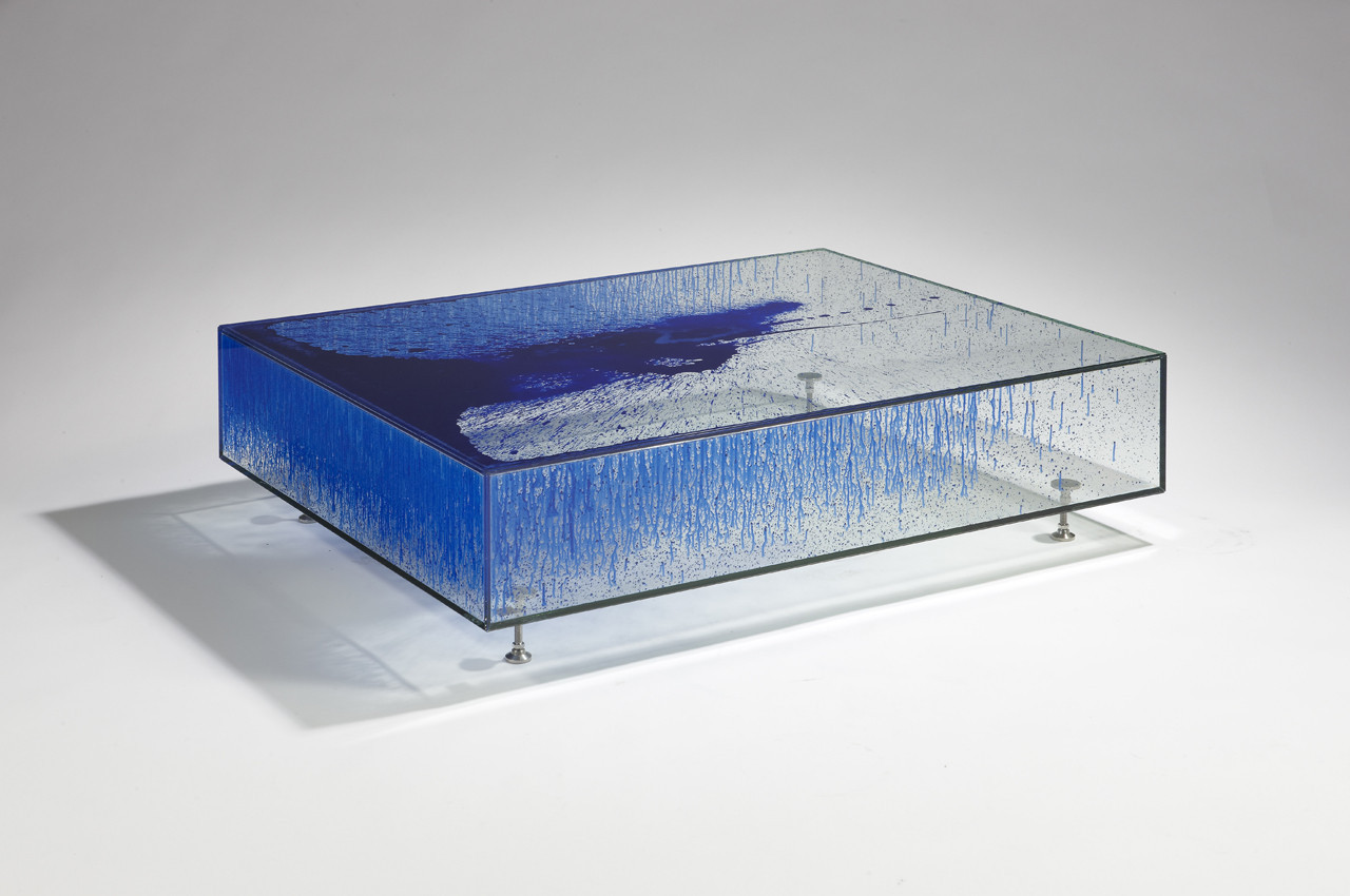
We used this format to create perfect mitre-cut glass boxes, an exoskeleton of glass, a vessel for expressive energy. Are they tables? Are they vitrines? Does it matter?
As Dr Glenn Adamson describes “These orthogonal forms are filled with various substances – paint, feathers, or acrylic – and set on short metal legs, sourced from an industrial machinery supplier. The precedents for the series are clear enough – Donald Judd’s Minimalist furniture, the sculptures of Yves Klein, or for that matter, any museum vitrine. The Units represent an occupation of this established visual language. The neutral box is treated as a window: inside each one, a material experiment unfolds, a specimen under glass.”
The first 3 works were created in 2004 for our inaugural solo show in New York. It was an immense freedom to start to work in this manner, we could focus on the expression these works should have within them and the story we wanted to tell to the audience.
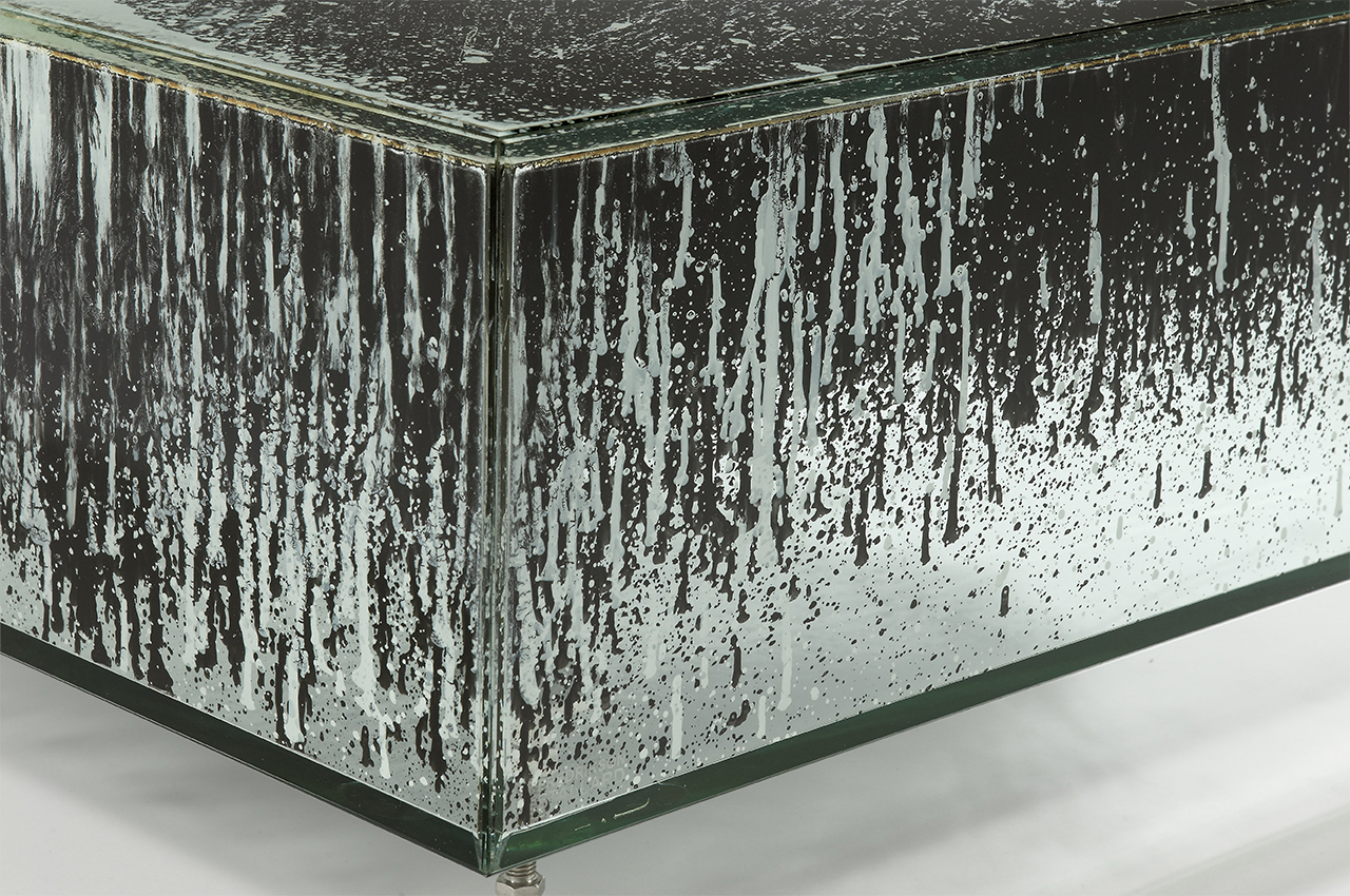
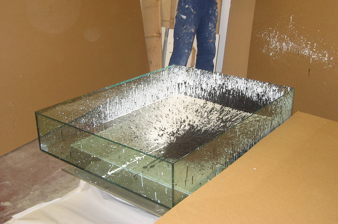
For the first one, “Monochrome” we had exploded black and white paint inside under high pressure. The intermixing of black and white formed a curtains of paint, concealing parts and leaving other parts of the piece totally transparent.
The process to explode paint into a closed glass box was our attempt to break away from accepted conventions to unleash a new confidence in design. We have always believed “function” exists in both the physical as well as the psychological and this is were the Units and their freedom of expression comes into play. We wanted to make work that confronts, it was about capturing a moment, a reminder of time, a record of us as creators.
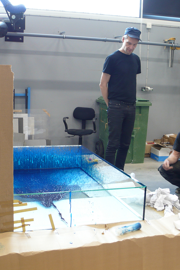
Glenn Adamson continues: “Rather like a Jackson Pollock (which is of course another conscious reference), the paint seems to be chaotic, perhaps the result of an explosion, but is actually painstakingly applied by hand in an ingenious contemporary take on the traditional technique of verre eglomisé. It takes about a month to dry, at which point the box is hermetically sealed, trapping the fragile composition within. The painting was done by Patrik and Ian personally, on site at the Swedish glass manufactory that fabricated the Units. Throughout the series, they were interested in a play of opposites – black/white, soft/hard, light/heavy, opaque/transparent. In Unit: Monochrome, this duality does not resolve into stasis, but retains the liquid potentiality that was present at the moment of creation.”
The second Unit “White” was filled with white goose down. The strange thing is that when you put an object on it, the object appeared to sink slightly, an optical illusion caused perhaps by shadows or perhaps by perception. “White” was supposed to sit alongside “Black” – which was to be filled with crude oil. Maybe one day we will make “Black” but in the early stages of our career, getting hold of 325 litres of crude oil and shipping it to New York in a glass box was slightly above our means.
So instead we created the third, “Diptych”, a Unit cut in half, each half containing a levitating single sheet – one black and one white.
They all had totally different expressions, today it may seem obvious, but it was a revelation to us at that time to be able to work in this way and to felt we have achieved the longing to free ourself from the rigid cuffs that we felt constrained creativity in furniture design.
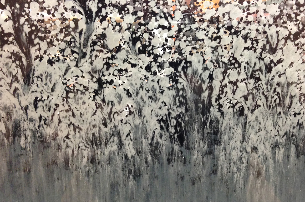
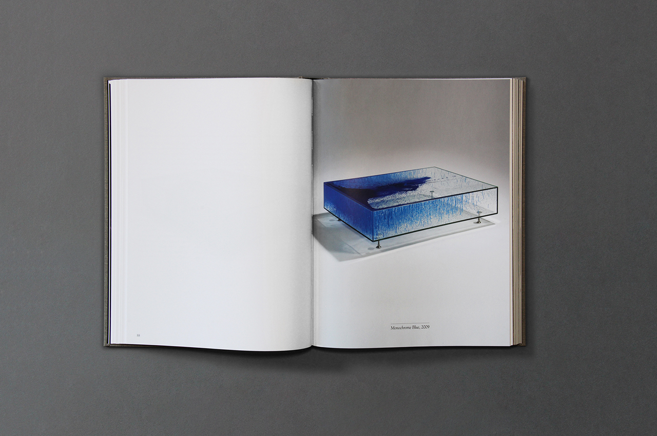
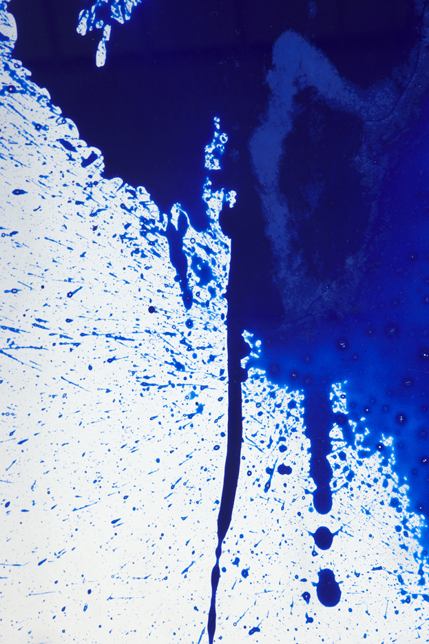
Colour came a little later than the original monochrome. At the beginning we felt we didn’t want to confuse the expression with colours, to keep it “clean” and not to distract from the process. Later, as our confidence grew, colour was inevitably making its way into our work. We always dived into the deep end and immediately started to explore the really strong colour, Deep Reds and vibrant Pinks to the bright yellow and emerald greens, trying to explore their different emotional tones, how they communicate and in what context we would be able to use them. But it was with blue that we took or first steps and started to apply this in our work. Each colour has obvious references to history and the arts and blue was the colour of chose to represent the heavens, god and angels to its vibrant use with modern artists such as Klein, Picasso and Miro. When we use blue for the “Unit Monochrome Blue” our action is recorded differently that to of the black and white original. The blue is electric, it vibrates with different shadings and luminosities projecting its surrounding blue with light that comes through the translucent parts and reflects back the deep saturation where it has blended into the opaque. The blue colour captures the very fractal moment when we let the paint hit the surface of the glass. The paint forms rivers and lakes, some paint remains as static drops whilst other parts like shooting stars are frozen in their direction. It is a three dimensional document of artistic process our and telling of a story as a landscape of colour frozen in time.
